ISPAY
An All-in-One B2B/B2C Global Payment & Settlement Infrastructure for Web2 Globalizing Enterprises and Web3 Native Ecosystems(Currently in internal testing).
00

挑战
1. The legacy web UI split core actions across heavy, multi-column data tables.High friction in daily tasks. 2. The legacy B2B platform lacked a cohesive modern identity and failed to align with current consumer FinTech standards 3. The business needed a fast market launch without re-engineering the existing backend architecture.
解决方案
1. Built a brand-new Figma Design System (Variables & Tokens) . 2. Used AI workflows for rapid prototyping to quickly validate user flows and key touchpoints 3. Worked in tight alignment with the engineering team to optimize key interaction logic within the core architecture, achieving maximum user experience improvement with minimal code refactoring.
影响
Delivered the complete 0-to-1 App design in 3 months. Built 30+ reusable Figma components, shortening dev handoff from days to hours.
Background
ISPAY was originally a complex B2B Web platform providing multi-currency global remittance, cryptocurrency management, and virtual payment card issuance.
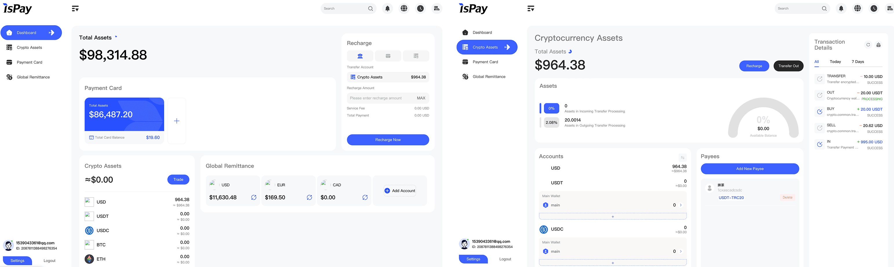
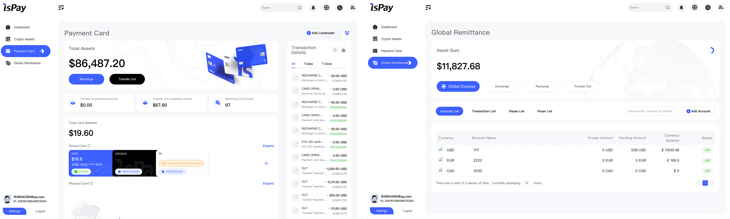
While robust for enterprise admins, the platform was far too complex for retail consumers who needed fast, on-the-go financial management. My mission as the sole designer was to lead the 0-to-1 design transformation—distilling complex B2B financial logic into a intuitive, high-velocity consumer mobile app within a tight 3-month timeline.
Redesigning the Information Architecture
Competitive Analysis & Pattern Recognition:
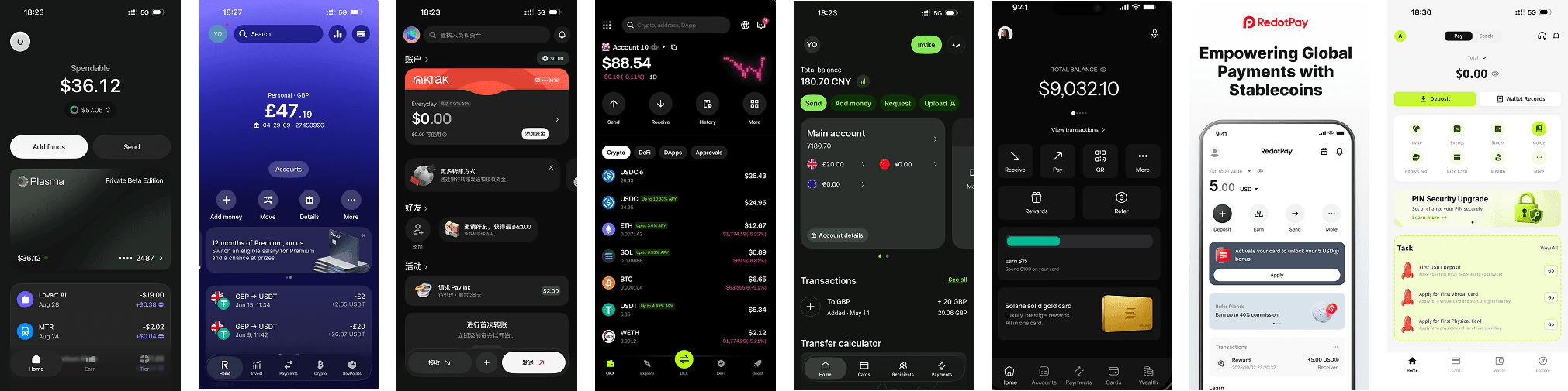
I benchmarked leading global Web3/FinTech applications—including digital banks, crypto exchanges , and crypto payment cards. The key finding was that successful FinTech apps prioritize Add Money and Send actions on the primary hero section, ensuring core cash-flow tasks are zero clicks away.

Based on industry Mental Models, I re-architected the home layout:
Grouped high-frequency quick actions (Add money, Transfer, Convert) into a unified bar, giving primary visual weight to Add money.
Elevated our core Payout feature into a standalone bottom tab to significantly boost its visual hierarchy.
Cards Wallet Management
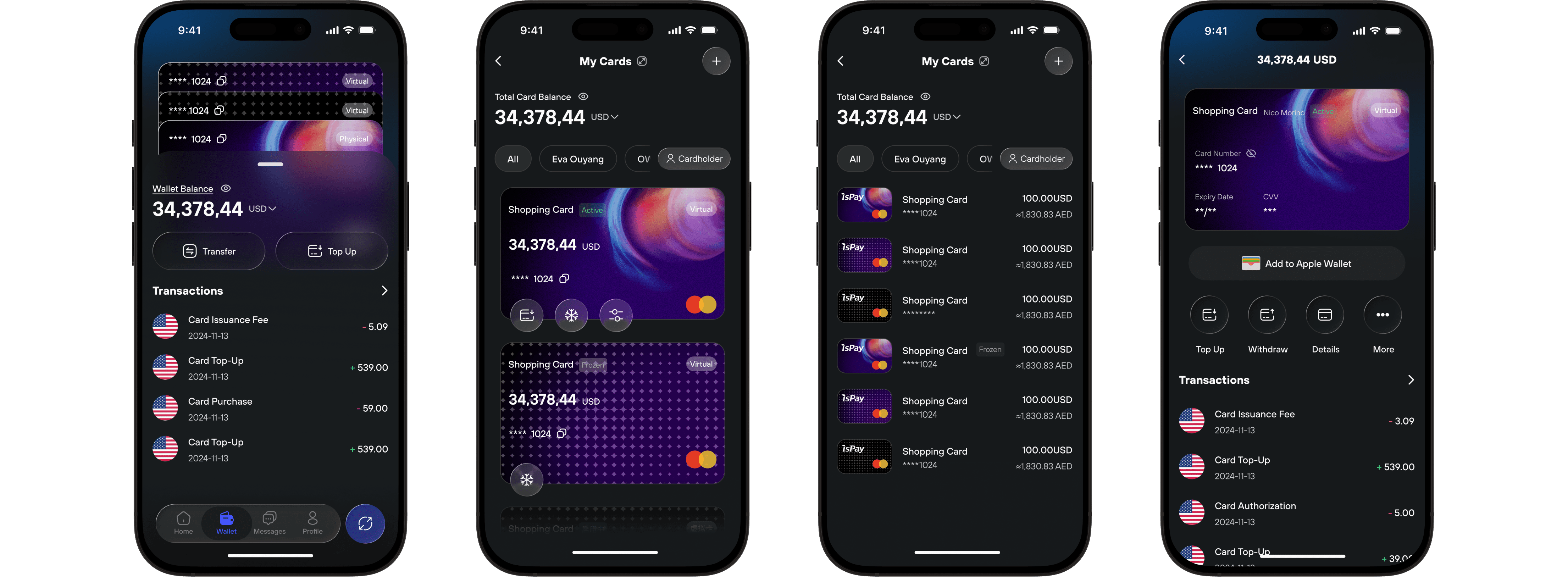
To solve the backend constraint where funds must be transferred to the Cards Wallet before topping up individual cards, I redesigned the Cards section:
Designed a peek-through bottom sheet with partially exposed card edges to intuitively guide users to transfer funds into the Cards Wallet first.
Enabled quick taps or swipe gestures to seamlessly expand or collapse the card stack for instant access to card controls.
Integrated cardholder filters and view toggles based on our B2B capabilities and real-world business scenarios to support multi-cardholder management and handle large card portfolios.
Optimizing Core Payment Flow
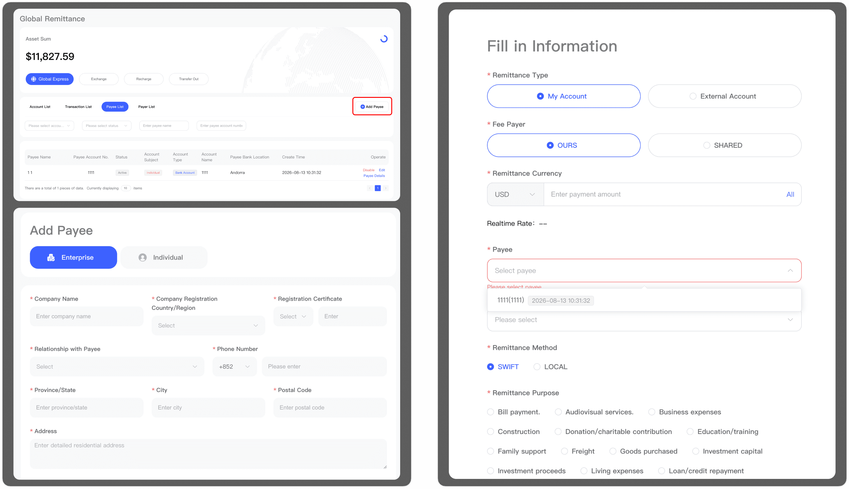
In the legacy system, before users could make any transfer, they had to navigate to the Remittance Account section to create a payee and submit it for review. Only after the payee was approved by the backend could users enter the "Send" screen, select that payee, and complete the payment.
This fragmented, two-step system created massive operational friction, interrupting the user's primary mental goal—sending money quickly—with rigid administrative setup tasks.
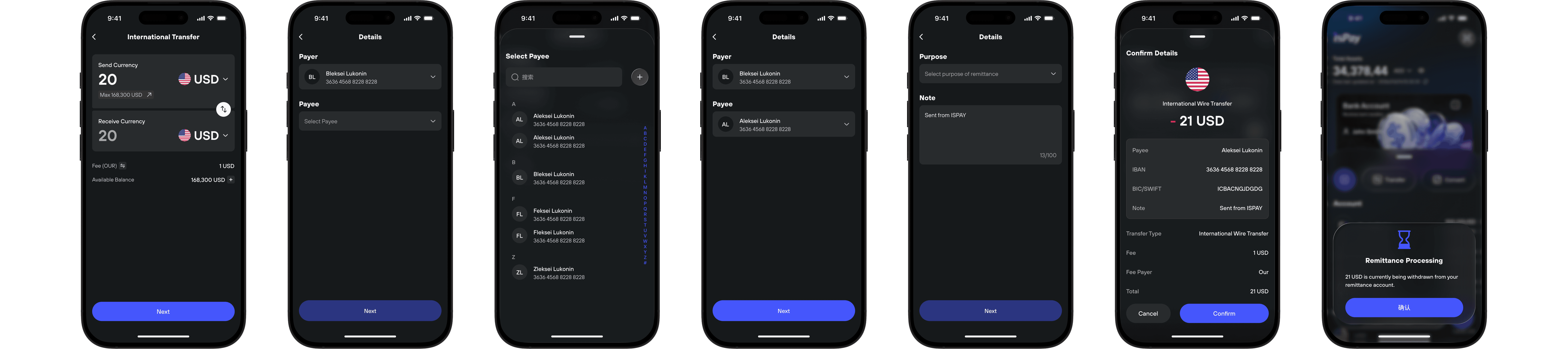
To streamline the payment flow and eliminate pre-transfer setup friction, I made the following UX optimizations:
Streamlined Multi-Step Flow: Transformed the remittance journey into a clean 4-step progressive modal flow (Amount & Currency -> Payer & Payee -> Remittance Purpose & Notes -> Final Confirmation & Processing), cutting cognitive friction during cross-border transfers.
Embedded Payee Creation & Alphabetical Sorting: Integrated new payee creation directly within the transfer step—eliminating pre-mandatory setup—and added alphabetical A-Z sorting to accelerate recipient search.
Smart Payer Memory: Set the default payer to the user's primary account or the last selected entity, eliminating redundant manual choices and speeding up settlement execution.
Problem Solving
要解决“原业务链路太长(KYC $\rightarrow$ 充值资金账户 $\rightarrow$ 划转卡包账户 $\rightarrow$ 申请卡片)导致新用户流失”的问题,产品设计的核心原则是“将复杂的后端逻辑封装在‘申请卡片’这一个动作背后”,对用户屏蔽手动划转的成本,实现单向流线的开卡向导(Wizard Flow)。
年
2026
项目周期
6 months
工具
Figma
类目
End-to-End Product Design & Branding
主要任务
Designed end-to-end 0-to-1 B2B/ToC FinTech products
01

02

03

04

05

06

07